Great product imagery moves people to click, zoom, and buy. With 3D product rendering (CGI), you’re not limited by what a camera can capture—you can place a product anywhere, reveal inner components, or show how it assembles, all with pixel-level control. In this guide, we’ll break down the four essential types of product renders—hero, lifestyle, cutaway, and exploded views—and show you when to use each, what makes them great, and how to brief your designer or 3D studio. Whether you’re building Amazon listing images, DTC PDPs, investor decks, or packaging, choosing the right render type will improve clarity, lower returns, and lift conversion.
Quick definitions (the core types of product renders)
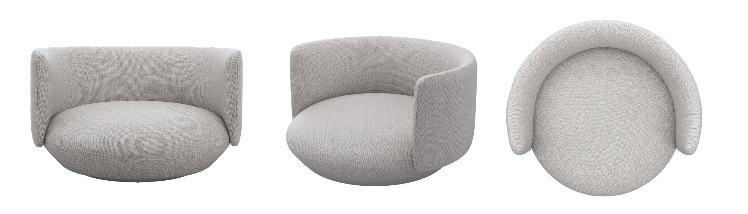
- Hero render: A clean, polished, front-and-center image that showcases your product’s best angle.
- Lifestyle render: The product placed “in the wild”—a real or stylized environment that expresses use, scale, and brand.
- Cutaway render: Part of the product appears sliced to reveal interior components or structure.
- Exploded view render: An assembly diagram where parts are separated along an axis to show how they fit together.
Hero Renders: Your Primary Sales Image
Most shoppers decide whether to click in under two seconds. The hero render is the image that earns — or loses — that click.
The hero is your definitive beauty shot: one product, one clean background, every material and finish dialed in to perfection. No context, no props, no story — just the product at its absolute best. It appears as the lead image on product detail pages, category listings, press kits, packaging front panels, and launch campaigns. When this image is weak, everything downstream suffers regardless of how good the product actually is.
When to use it
- As the primary image on e-commerce listings and category pages
- On packaging front panels and sell sheets
- For launch campaigns where a single iconic angle carries the brand moment
- On pitch decks and investor materials where first impressions count
When not to: Don’t rely on a hero render alone for products with complex interiors, multiple components, or assembly steps — shoppers will click away with unanswered questions.
Best practices
Getting a hero right is less about drama and more about discipline. Every decision should serve clarity.
- Angle and composition: A three-quarter angle adds depth without distortion; keep verticals straight to avoid a “tipping” look that reads as amateur
- Lighting: Treat it like studio product photography — soft key light, gentle fill, controlled speculars. HDRIs and area lights give the most natural results
- Materials: Use calibrated PBR materials (metalness/roughness workflow) with color-accurate swatches. For plastics and coatings, refine clearcoat and micro-roughness to control highlight bloom
- Detailing: Subtle edge bevels, realistic labels with minor imperfections, and correct IOR values for glass or lenses — these are what separate a good render from a great one
- Background: Pure white or a neutral gradient. A faint shadow or ground reflection anchors the product without competing with it
Common mistakes
- Over-polished surfaces that read as plastic or fake rather than premium
- Busy or colored backgrounds that pull the eye away from the product
- Scale errors — logo sizes or button proportions that don’t match real-world dimensions
Typical deliverable
Format: JPG (web) or TIFF (retouch) · Resolution: 3000 × 3000 px minimum · Background: pure white RGB 255/255/255 · Variants: front, three-quarter, detail crop
→ See our 3D product rendering services if you need studio-quality hero images for your listings.
Lifestyle Renders: Context, Story, and Emotion

A product without context is a product without a customer. Lifestyle renders do the job that a hero never can: they show people what it feels like to own the thing.
By placing your product in a believable or aspirational scene — a sun-lit kitchen counter, a minimalist living room, a mountain trail — a lifestyle render answers the questions shoppers don’t always voice: Will this fit my space? Does it match my taste? Is this for someone like me? That emotional alignment drives add-to-cart decisions far more than specs do.
When to use it
- As secondary images on PDPs to show scale, proportion, and use in context
- In social ads, catalogs, and landing pages where emotion drives engagement
- For A+ content modules and rich media placements
- Across multiple crops for vertical (Reels/Stories), square (Instagram), and 16:9 (site banners)
When not to: Avoid lifestyle renders as your only image for technical B2B products where precision and specs matter more than aspiration — engineering buyers want clarity, not mood.
Best practices
The product is still the hero. Everything in the scene exists to serve it.
- Audience-first art direction: Choose environments that reflect your customer’s actual life or aspiration — a Scandinavian minimal kitchen for a premium kettle, an industrial workshop bench for a professional tool
- Consistent lighting temperature: Match scene lights to product materials. Warm tungsten suits wood and warm-toned surfaces; cooler daylight flatters stainless steel and clean whites
- Human touch without people: Hand shadows, a folded towel, an open book nearby — small signs of life add warmth without the cost and complexity of character rigs
- Props with purpose: Every prop should either clarify scale or reinforce the use case. If it doesn’t do one of those two things, cut it
- Performance variants: Plan multiple crops at brief time — one master scene can yield vertical, square, and widescreen exports without a full re-render
Common mistakes
- Over-styled scenes where the environment outshines the product
- Mismatched shadow direction or color temperature between the product and its setting
- Generic or low-resolution backplates that immediately betray the composite
Typical deliverable
Format: JPG or PNG · Resolution: 3000 px on shortest side · Background: scene-dependent · Variants: 1:1, 4:5, 16:9 crops for platform coverage
Cutaway Renders: Show the Inside Story

The best cutaway renders sell the parts customers can’t see — and that’s precisely what builds trust in a product that looks like every other option on the shelf.
A cutaway “slices” the model to expose interior components — foam layers, filters, bearings, electronics, insulation — while keeping the overall silhouette recognizable. Unlike a technical diagram, it stays photorealistic: the exterior looks like the product, and the cross-section looks like what’s actually inside. Engineers love it. Savvy buyers love it. And it’s often the image that tips a considered purchase.
When to use it
- For technical products where internal quality drives the value proposition — air purifiers, footwear midsoles, coolers, mattresses, helmets
- In investor decks and B2B datasheets to demonstrate engineering sophistication
- For education and compliance — explaining safety construction, thermal performance, or acoustic layering
- In A+ content to address the “but what’s it made of?” objection before it arises
When not to: Don’t use a cutaway for products whose interior isn’t a selling point or looks unremarkable. A kitchen utensil with a plain plastic core doesn’t need this treatment.
Best practices
The goal is surgical clarity — the reader should understand the interior at a glance.
- Clean section plane: Use precise boolean cuts, then add a slight bevel to the cut face so it reads as intentional rather than a rendering artifact
- Material separation: Assign visually distinct materials to each interior layer and use subtle numbered callouts to label them — not dense paragraphs of annotation
- Depth management: Use depth of field sparingly. Clarity matters more than cinematic atmosphere here; the viewer needs to read every layer
- Color coding: Adopt a palette where each internal system is immediately distinguishable — blue for cooling circuits, orange for electrical paths, grey for structural elements
Common mistakes
- Too many callouts that turn the image into a wall of text — three to five labels is usually the ceiling
- Cutting through logos, key features, or branding elements unintentionally
- Noisy or overly busy textures on the section face that compete with the components
Typical deliverable
Format: PNG (transparent) or PSD with layers · Resolution: 3000 px+ · Variants: labeled and unlabeled versions; section plane options (front, side, diagonal)
→ Need a cutaway that communicates your product’s engineering? Talk to our team →
Exploded View Renders: How It Assembles
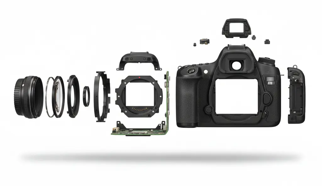
If a customer has to ask “how does this go together?”, an exploded view has already failed them. Done well, it makes the answer obvious before the question forms.
An exploded view separates components along one or more axes — each part pulled back from its assembled position just enough to reveal the sequence and relationships. It’s the most elegant way to say: here’s how it’s built, here’s what’s inside, and here’s why that matters. Unlike a cutaway, which reveals layers, an exploded view shows discrete parts and how they connect — making it the natural choice for anything with assembly, replacement parts, or modular components.
When to use it
- In instructionals and quick-start guides where assembly sequence needs to be immediately clear
- In B2B presentations to illustrate serviceability, parts availability, or modular configuration
- In marketing to communicate craftsmanship — “CNC-milled alloy chassis, 7-layer filter stack, tool-free disassembly” lands harder with a visual that proves it
- As a short looped animation (MP4 or GIF) for PDPs and social ads — animated exploded views are increasingly outperforming static versions in engagement
When not to: Don’t use an exploded view for products with too many small parts in a single frame — the result is a confusing cloud of components. Break complex products into subsystem stages instead.
Best practices
The diagram should read like a sentence, not a puzzle.
- Order and alignment: Keep parts on consistent axis rails. Parts should feel as though they’re sliding into place, not floating at random
- Spacing logic: Equal gaps between parts reads as intentional and professional. Vary spacing only to visually group related subsystems
- Callouts: Use numbered markers that map to a concise legend below the image — five to eight callouts is usually ideal. More than that, consider splitting into two diagrams
- Occlusion control: Dark parts against dark backgrounds disappear. Use subtle rim lighting or thin highlight outlines to keep every component readable
Common mistakes
- Too many components in a single frame — split complex products into subsystem diagrams or a staged animation
- Conflicting cast shadows that imply physically impossible part positions
- Overlapping labels or leader lines that make the diagram unreadable at display size
Typical deliverable
Format: PNG (white or transparent bg) or MP4 loop · Resolution: 3000 px+ · Variants: static labeled, static unlabeled, animated assembly sequence
Which Types of Product Renders Should You Use? (At a Glance)
| Render type | Primary purpose | Ideal placement | Audience signal | When to skip it |
|---|---|---|---|---|
| Hero | Showcase form, finish, and quality | PDP lead image, packaging, press kit | Any buyer — this is always needed | Never — every product needs one |
| Lifestyle | Show context, scale, and emotional fit | PDP secondary images, social ads, A+ content | Aspiration-driven or DTC buyers | Technical B2B where specs outweigh emotion |
| Cutaway | Reveal interior quality and construction | A+ content, investor decks, B2B datasheets | Considered buyers, engineers, skeptics | Products with unremarkable or simple interiors |
| Exploded view | Explain assembly, parts, and modularity | Manuals, guides, B2B presentations, marketing | Assembly-aware buyers, service teams | Products with 20+ micro-parts (split into stages instead) |
Pro tip: Most high-performing PDPs mix one hero, one lifestyle, and one clarity image (cutaway or exploded) for a balanced story. This balance uses multiple types of product renders to answer shopper questions fast.
File Specs & Delivery for E-commerce
- Aspect ratios:
- Marketplaces often prefer 1:1 (square); keep a master at 3000–4000 px on the shortest side.
- For DTC hero banners, prepare 16:9 and 4:5 variants.
- Background:
- Pure white (RGB 255/255/255) for primary listing images where required.
- Transparent PNG for overlays; TIFF/EXR for retouch or color-managed workflows.
- Color management:
- Work in linear/ACEScg internally if you can; export sRGB PNG/JPG for web.
- Build a color swatch approval loop with your team to ensure brand accuracy.
- AR/3D:
- Keep GLB/GLTF (web) and USDZ (iOS) versions handy for 3D viewers and try-in-room experiences.
- Optimize polycount and texture maps (2K is often enough for web).
Workflow Tips for Photoreal Results
- Start from CAD, end with polish. Convert STEP/IGES to a DCC app (Blender/KeyShot/V-Ray). Clean topology, add bevels, assign watertight materials.
- PBR materials, not guesses. Capture roughness/normal details; use measured IOR and specular values for metals, glass, and coatings.
- Lighting is everything. Build a three-light scheme (key/fill/rim) and test angles with a clay shader first. Add HDRI only when it helps reflections.
- Micro-details sell scale. Subtle fingerprints, machining marks, or injection pin shadows—kept very restrained—add believability.
- QA checklist: Dimensions, labels, safety icons, and color consistency across all types of product renders.
- Render for reuse. Save cameras and light rigs. You’ll reuse them across hero, lifestyle, and clarity images for consistent look & feel.
- Consider short loops. A turntable (hero), a parallax push (lifestyle), or an assembly animation (exploded) can supercharge ads and PDP engagement.
How to Brief Your 3D Studio (or Internal Team)
- Objective & placement: “We need a hero for PDP #1, a kitchen lifestyle for PDP #2, and a cutaway for A+ content.”
- Reference angles: Screenshots of competitor images that convert well, plus any “do-not-do” examples.
- Brand look: Lighting mood board (warm/cool), background palettes, and composition rules (negative space for text, rule of thirds).
- CAD & logos: Clean geometry, high-res vector logos/decals, material references (e.g., Pantone/RAL), and tolerance notes.
- Copy & callouts: Finalized label text for cutaways/exploded views to avoid late changes.
- Deliverables: Pixel sizes, file formats, crops, and platform requirements (marketplace vs. DTC).
Wrap-up
Choose the hero to stop the scroll, lifestyle to tell the story, cutaway to prove performance, and exploded to explain assembly. With a consistent lighting rig, calibrated materials, and a solid QA pass, these four render types cover nearly every e-commerce, packaging, and marketing need. If you’re mapping out a full content set, pair this article with your [3D Product Rendering Guide] for deeper dives on benefits, costs, and workflow.